


With more than 6.9 billion search requests per day, Google is the most used search engine in the world.
After reading this article, you will know everything about Google. The origin of its name, its logo, and its colors…
The brand will be completely familiar to you.
Who is the creator of Google?
There is not one creator only, Google was born as a result of the work of Larry Page and Sergei Brin. Google was originally a study project, called Backrub, intended to connect information for Stanford University. This project has grown enormously to become the huge company that we all know today.
What is the meaning of the word Google?
Today, 24 years after its creation, we do not know the real meaning of the name. There are 3 possible reasons, but the founders of Google are keeping them secret.
We know that when the company was launched, the two founders asked a class of computer science students to come up with a name. Thanks to them, the two entrepreneurs came up with the idea of the name “Gogol” referring to the mathematical number 10^100 (fortunately they did not choose this name, it would have made the French-speaking community laugh a lot).
However, the final name of the firm transformed into Google.
The evolution of the Google logo from 1997 to today
From 1997 to 2021, the design has changed a lot, we will see the evolution of all Google logos and try to explain why these choices were made.
1996

Before the creation of Google, one of its creators had imagined Backrub. It is in fact a web browser that will turn into the Google that everyone knows today. The logo is very simple: it is the name Backrub in red and a picture of Larry Page’s left hand.
1997

It’s hard to believe but this is the first Google logo. We can already see the colors present on all the logos of the firm today. At that time, Google was only a study project of Stanford University in the United States.
Early 1998
![]()
A year later, Google started designing its logo, using the Baskerville font. We notice that this logo has the same colors as nowadays, except that the G is in green and not in blue.
End 1998
![]()
At the end of 1998, the logo evolved from the previous one. This year, Google decided to change the color green to blue. These are the colors that remained unchanged since then. In addition, the effect of shading appears on the logo to give it a little depth. The Google logo is represented with a “! This was borrowed from the competing search engine “Yahoo!” which was gaining popularity at that time.
1999-2010
![]()
At the end of 1999, the company decided to change its logo to the one that many of us still have in mind when thinking about this brand. The Baskerville made room for the font called Catull. However, designer Ruth Kedar, also from Stanford University, decided to keep the shading. This logo is among all the others, the one that the brand has kept the longest.
2011
![]()
After 11 years, the company decided to make slight changes to its logo to keep up with the times. The logo loses its shading while retaining its 3D effect and the letters have become more colorful.
2013
![]()
The logo keeps its font, however, they removed the shadows and turned it into a flat design.
This type of graphic design is characterized by its minimalism and bright colors. It looks more aesthetically pleasing, and it is more practical as well. Using the internet on a mobile phone is becoming increasingly popular and this type of style is more convenient for adapting the logo to the size of the phone screen.
2015-2022
![]()
This is the current logo of Google, which appeared in 2015. Google was still inspired by the flat design and changed the font from Catull to a sans serif font named Product Sans.
Google became a market leader and is offering many services. Therefore, the logo of Google is easily adaptable to all products of the brand.
G logo

The Google G logo is used as a favicon by Google. A favicon is a small icon associated with a brand identity that is used to represent a website or a program. This symbol can be found in the address bar, bookmarks, web tabs, and hotkeys.
This logo is also used as a symbol for the Google application on smartphones.
Now, that the company has become involved in several areas of activity, it is difficult to say what the logo of Google is. However, the G with the 4 colors is the one that the company uses the most.
Why did Google choose these colors for its logo?
From a communication point of view, the choice of the colors of the Google logo is something important for a company. Psychologically, these colors have an impact on our brains, and each color is associated with human behavior. We will neglect the rumor that these colors are inspired by Lego bricks and we will try to examine why Google would have chosen these colors.
Blue
It represents calmness, change, and confidence. An important detail: blue is the most loved color in the world.
Red
It is the most visible primary color. It can sometimes be associated with danger, hence the color of fire trucks, but it also represents very strong emotions such as passion, love, energy, and dynamism.
Yellow
It is bringing brightness to a design. Yellow represents youth and cheerfulness. It is the color of the sun and represents happiness. However culturally, yellow is also a color that evokes an unfavorable association. For example, Judas was supposed to be dressed in yellow, the yellow star, etc.
Green
It is the only color of the logo that is not a primary color. Green is associated with growth, hope, wealth, and nature. It is a color that reflects confidence and safety.
Why does the google logo contain these colors rather than the old ones?
When the Google logo changed to its 2013 logo, they decided to use brighter colors than in the past.
Here are the hexadecimal codes corresponding to these colors:
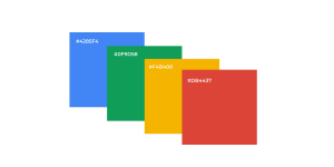
Making the colors brighter was a strategic move. The Google design team adjusted the color saturation to maintain a balance between the white spaces and their logo. They chose to emphasize the feeling of a very bright and dynamic logo. When we look at the history of the Google Chrome logo, we quickly understand the decision of the firm regarding the choice of colors for the logo.
The characteristics of their logo
Contrary to what one might think, the choice of a logo is extensively studied by a brand.
3 features that will always be present
Here are the 3 key points that determine the design of the logos of the firm Google
- The iconic colors
Each of the Google logos must include the brand’s iconic colors.
- Simplicity
The company’s logos are not very extravagant and always remain very simple and clean. Combined with bright colors that bring the logo to life.
- Adaptability
Google is the market leader in search engines. It has to offer a logo that can be adapted to any type of support. Since 2013, a responsive design has been implemented which allows a perfect visualization for every dimension.
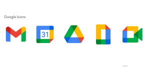
The applications of Google
When looking at the Google Company in 2022, one can see that Google is not just a search engine anymore. The company offers many services.
Google Chrome, Google Maps; Google Drive; Google cloud; Google Play Store …
All these logos are inspired by the current Google logo and are regularly updated.
Updating the logos of the different services avoids a feeling of boredom among users.
The compliance of the graphic design
When looking at the graphic design of Google, one can see that the company complies with one design. The shades and colors that you will find on all their logos are the same. This allows them to strengthen their brand image and create a universal feeling when using Google.
The Googles Doodles
Googles Doodles have been an integral part of Google’s brand identity. They are variations of the Google logo depending on particular events and dates. There are several hundred of them, the Doodles are customized for different cultures and countries. Now, an entire service is dedicated to the creation of Doodle and you can send your ideas to doodleproposals@google.com.
History
Born in 1999, the concept of Doodles first appeared when the two founders redesigned their logo with a drawing of “Burning Man”, a symbol of a festival held every year in the Black Rock Desert in Nevada. They did this to announce that they were joining the festival and would be inactive for a few days.

In 2000, the company decided to implement Doodles as a recurring concept.
The Google Doodles directory
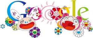
Since their creation, over 4,000 Doodles have been created for home pages around the world. The concept has been growing along with the brand and Google has even collaborated with popular artists. For example, this Doodle celebrates summer. It was drawn by the artist Takashi Murakami on June 21, 2011. Here, a list of all the Google Doodles can be found.
If you enjoyed this article, feel free to look at others in the blog section of our website. You will find articles covering the key points of an SEO and SEA strategy such as keyword selection, guides for using specific software such as Screaming Frog or SE ranking, and also articles relating to current events.


Good job! I understand why you remarked only on the positive characteristics of the Google colours, however, a non-biased report would include both the favorable and unsavory.